

Is a distressed look a good or a bad thing? The answer depends upon whether it was intended. A distressed look can mean poorly executed screen printing, as we described in an earlier blog post, Why Screen Printed Jerseys Peel and Flake. However, distressed by design is a whole different animal.
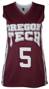
We recently had a client ask us to make a small run of ladies’ basketball jerseys. The client wanted names and jersey numbers on the back, but the only instruction for the front was that we have the team name arching across the chest. We invited the client to choose a jersey style. She chose a style that we had not previously worked on, the Teamwork Athletic Ladies Matrix, which is featured this way in the supplier’s catalog:
Nothing wrong with the way it’s decorated in the catalog photo. In fact, it looks pretty sharp. We ordered the jerseys.
A few days later the box arrived. When we looked more closely at the decorative side trim on the jerseys, we noticed that it had randomized, spotted effect in the stripe. That is when we realized that we could go beyond the basic look with this one and maybe do something better.
So we looked at a proof of the team name in a basic arch and then with a “distressed” pattern added into the design. The distressed pattern is essentially a random collection of small dots, triangles, and other geometric shapes that make the design look…like it’s been a bit wind-battered.
When you see the two designs side by side, your first reaction might be to wonder why anyone would want something new to look old.
But the client’s team name was “Storm.” Wind-battered look? Instant hit!
Below is a phone pic of the final product, with which the client was completely delighted.
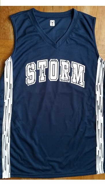
So the bottom line it that a distressed screen print design is a matter of choice, and when combined with a garment that plays off the distressed look, “distressed” can look smashingly good!