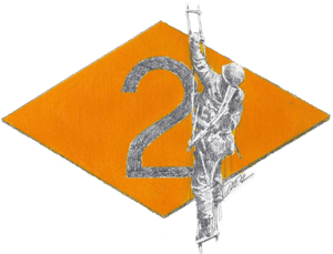
Periodically we have to dig through a box of old stitchouts of logos. During this process, we sometimes come across the embroidered logo stitchout we did for the Pointe du Hoc Foundation, whose original art is featured below.

We always stop for a moment, partly to contemplate the challenge that cliff represented to those troops, and partly to admire the detail our logo digitizer put into the design. There’s a story to be told here.
We get calls and e-mails at least ten times per week from embroidery digitizers asking for our business. The pitch is always something to the effect of “super cheap discount digitizing.” We know what that means because we made the mistake of using some of these companies when our firm was in its infancy. But we only recently realized that the Pte. du Hoc logo was a good way to show our clients what the difference is.
The featured image at the top of the screen is of two versions of this embroidered logo. The one on the left would be considered an acceptable outcome by many embroidery shops and their clients. Why not? The original image has only two colors — they are both still here. The shapes are consistent with the original art. And best of all to the embroidery shop is the fact that this minimalist version on the left requires 6,130 stitches, which equates to about 10-12 minutes of machine time. Crank those puppies out and move on to the next job because time is money, folks!
The version on the right has what going for it? It has a satin border stitch around the diamond that looks sharp. We don’t like that. The “2” is the same. What are all those extra elements on the infantryman? Uggh. How dare a digitizer and embroidery shop use texture to bring life to a design?! Worst of all, this design requires 8,216 stitches, which would add 3-4 minutes of machine time. Egads! That’s going to take a lot more machine time over the course of day. Bummer. And who on earth would prefer the image on the right anyway?
You would! Of course you would. Everyone would prefer the version on the right. It shows that the digitizer and the embroidery shop care about their work…because they cater to clients who care about their image.
The unfortunate thing is that even the screen shot of the version on the right doesn’t do justice to the actual stitchout. All of those little extra details combine to absort and reflect the ambient light much more beautifully in real life.
Work with a quality embroidery shop that wants to go the extra mile. Otherwise you won’t know what you’re missing.


