

Dear Graphic Designers,
With all due respect to you and your profession, may we humbly suggest that there may a hole in your perspective? This is a hole that your clients may be discovering long after your design work has been completed and approved with great fanfare. This hole may be causing your magnificent logo creation to need to be modified, with your client’s (disappointed) knowledge and understanding, even in direct contravention of the very style guide you may have created to prevent this very thing from ever happening!
We have the greatest respect for what graphic designers do. You think through how to encapsulate a company’s mission, vision, culture, or mere “sense” into a small bit of art around which the company intends to build its brand. No doubt you as an individual discovered you had the creative bug at an early age and are pleased to have found a way to utiltize that skill to make a living. You may have spent multiple semesters studying art and/or graphic design in school, and paid no small sum for that opportunity. You probably interned at a creative branding or advertising company or two, or three, or four, all to acquire the skills you now put to use trying to make a client’s dream come alive. You spend many of your days and nights looking at one or more high definition monitors. You catch sometimes even the most minor pixel problems in digital print proofs of collateral material for your clients — things that you could see, but that your clients may have never noticed. You possess talent, skills, equipment, software, and, yes, even patience that are not required in the line of business of an embroidery shop. You labor over your client’s image.
A high quality embroidery shop focuses on translating your creativity into branded corporate apparel for your clients. We want that fantastic logo you designed to look great on your clients’ embroidered jackets, shirts, caps, scrubs, etc. In truth we want the same thing you want for your clients — their logos to look great in front of their audiences.
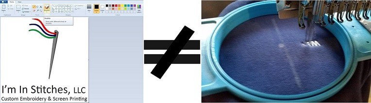
So where is the problem? The problem is that there are things that work great in pixels that do not work in the medium of thread on fabric. For example, you know how popular it us to use super thin fonts on a second text line? Or have you created a logo where the second line of text is right-justified, just so it can maintain its small look? Those are just a couple specific examples where embroidery shops are having conversatiosn with clients about whether and how the logo needs to be altered for use in thread. Would you not want to know what these challenges are and why they exist?
We are begging you to make an appointment to chat with a quality embroidery shop. Ask your favorite embroiderer:
- For stories of how that shop has had to talk clients through how their logos needed to be compromised in order to achieve an acceptable result.
- What general advice he or she would offer to a graphic designer.
- What he or she sees when looking at ten of your logo designs, either in person or via an online Slideshare presentation.
Talk with the embroiderer until you can see the designs from the perspective of someone who is working in another medium every day. This whole effort will probably cost you 30 to 60 minutes of your time. That is a pretty minimal investment when you look back at all that time schooling, training, and interning you have already done.
Even better, make a better style guide! Bounce that logo off your favorite embroidery shop to get thread colors to include in your style guide. That way you are the hero with the better product!
If you do not have a favorite embroidery shop, contact us! We at I’m In Stitches will be happy to spend this time with you. We would love to meet in person, if possible. If it is more convenient, we are also happy to spend time on the phone, on Skype, or on a Google Hangout. We all want to help you help your clients look their best.
Comments 1
I couldn’t agree with you more! I design t-shirts for a screen printing business. Customers come in with the smallest logo possible and want it enlarged to fit across the back of the shirt. No one seems to have a black and white copy of their logo. Nor do they have a vector file of it. I’m not sure whether it’s the design studios or the lack of education, every logo designed should have a black and white version. If clients are getting their logos from cheap sources, they are getting what they paid for and not getting the files necessary for good promotional products. Cheap logos cause additional design charges for the client. Not only should the designer talk to the embroidery shop, they should also talk to a screen printing shop. Thanks for this post, it was great! Sue Ann, prairiemagicdesign.com