

About a year ago we provided embroidered polos to Five Minute Productions, a Metro Atlanta-based marketing, advertising, and graphic design firm. When this client recommended to one of his own clients that they work with us for embroidered shirts, we were delighted. The way we see it, when a marketing and graphic design firm likes our logo embroidery work and service well enough to recommend us to their own clients, that is the highest compliment we can receive. But patting ourselves on the back quickly gave way to a long email match about white apparel that led us to think this was worthy of a blog post.
[custom_frame_right]![]() Let’s start with the logo itself. The dominant color theme is blue. The outermost box is a rich navy blue, with the “paper” text in a matching navy blue. The general rule to achieve maximum brand visibility for a logo is to have a high contrast between the logo and the background color theme. As pictured here, the logo achieves this effect nicely against a white background. In addition, a white background accentuates the white Z shape in the logo.
Let’s start with the logo itself. The dominant color theme is blue. The outermost box is a rich navy blue, with the “paper” text in a matching navy blue. The general rule to achieve maximum brand visibility for a logo is to have a high contrast between the logo and the background color theme. As pictured here, the logo achieves this effect nicely against a white background. In addition, a white background accentuates the white Z shape in the logo.
Got that? Ready for the pop quiz?
Q. If you were in charge of zPaper’s logo wear purchases to go with the company’s recent rebranding, your choice for a polo shirt color scheme would be:
C
A
|
B
|
C
|
D
|
|---|---|---|---|
E
|
F
|
G
|
H
|


Answer guide:
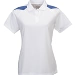
A. Solid white – a good choice. It picks up the white “Z” element nicely. Nothing needs to change. White shirts are always in stock somewhere, so that give you flexibility of suppliers and shirt styles. If there’s a problem, it’s not with the shirt color choice, but with the consideration of what you would do about embroidered caps and jackets some day in the future. Shirts can be washed easily to keep them looking clean. Caps and jackets pick up dirt. White caps are dirt magnets.
B. White with blue contrast panels – Maybe the most interesting choice, especially if one of the blues in the logo could be embroidered to match the blue in the contrast panel. Plus it would accentuate the white “Z” element again. The only problem is that white with blue contrast panels is not a common color scheme among shirt suppliers. That would not be an issue for a single order. But if you wanted to purchase a second round of shirts in six to twenty-four months for new staff, it’s not yet clear whether these will have survived the suppliers’ test of sufficient market demand or will have been discontinued due to poor sales.
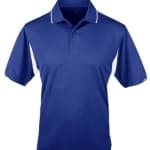
C. Solid blue – The “paper” text could be reversed out to white, but with no other guidance from the client about how to render the logo on dark backgrounds, the multicolor blue box would just not have a good contrast against the solid blue shirt.
D. Solid blue with white contrast panels — The “Z” element would be visible and maybe “paper” if that were reversed out to white, but otherwise the logo would be somewhat invisible again.
E. Solid black — This could work. The rich navy blue might be a bit too dark, but an embroiderer could probably cheat that particular color into a thread with a brighter hue. The “paper” text should probably still be reversed to white. And black shirts are always in stock somewhere, which again give you flexibility over styles and suppliers.
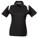
F. Solid black with white contrast panels — Suffers from the same surmountable challenges as E above, but the white contrast panels would pick up the white “Z” element again, which would be advantageous.
G. Solid heather grey — A good choice. Blue and grey go well together. The dark blue would contrast nicely. Plus, grey hides dirt better than white!
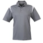
H. Medium grey with white contrast panels — This one could work if we cheated the dark blue up to a brighter hue and reversed the “paper” text to white.
So based upon all of that which would you choose?